
This was left over from my old blogging website and it was such a nice effect at the time it would be a shame to lose it.


So I'm bringing it here. There are elements of JavaScript but largely this is going to be CSS so lets get started.
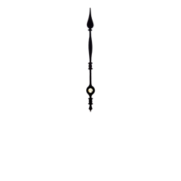
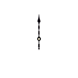
The first thing I needed were images to represent the clock's face, the hour hand, minute hand, and second hand. I made these by taking apart an image of a clock. They are square images and perfectly centred. You can see all four used in the final product below.
We layer them on top of one another using position: absolute; and set them to animate a 360 degree rotation at a set linear duration. Seconds are the largest unit of time which is valid with this property and so as you would expect:
| hand | duration |
|---|---|
| second | 60s |
| minute | 3600s |
| hour | 43200s |
By itself this would work but we want to set the time as well. Which means we need two different values for rotation. The animated duration and one that we start at. Therefore we must wrap each hand of the clock in a container.
<div class="clock-face">
    <img src="/images/256-face.png" alt="" />
    <div class="second-hand">
        <img src="/images/256-second-hand.png" alt="" />
    </div>
    <div class="minute-hand">
        <img src="/images/256-minute-hand.png" alt="" />
    </div>
    <div class="hour-hand">
        <img src="/images/256-hour-hand.png" alt="" />
    </div>
</div>
The images are going to be animated and the containers we will set at a rotation to start.
.clock-face {
    height: 128px;
    width: 128px;
    position: relative;
}

.clock-face > * {
    position: absolute;
    top: 0;
    left: 0;
    height: 128px;
    width: 128px;
}
.clock-face img {
    display: block;
    height: 128px;
    width: 128px;
}

.clock-face .second-hand img {
    animation: spin 60s linear infinite;
}
.clock-face .minute-hand img {
    animation: spin 3600s linear infinite;
}
.clock-face .hour-hand img {
    animation: spin 43200s linear infinite;
}

@keyframes spin { 100% { transform: rotate(360deg); } }
As you can see we need to be able to rotate the three hand containers using JavaScript. This function simply takes the .clock-face element, finds the appropriate hand, and rotates it by a set amount.
function rotate (container, name, amount) {
    var element = container.querySelector('.' + name);
    var transform = 'rotate(' + (amount * 360) + 'deg)';
    element.style.transform = transform;
}
Granted it's not the most beautiful function in the world but it serves a purpose, we will be rotating three elements. It expects to receive an amount, which should be a number between 0 and 1 representing the position of the hand on the clock face.
You have noticed I'm writing ES5 JavaScript for this tutorial and that's only because the example is simple enough that bringing a compiler into the mix isn't really warranted nor is forsaking our brothers and sisters using out of date browsers.
function makeClock (element, _timezoneOffset, _time) {
    var timezoneOffset = _timezoneOffset || 0;
    var time = _time || Date.now();
    var minutes = (time / 1000 / 60) - timezoneOffset;

    rotate(element, 'hour-hand', (minutes / 60 / 12) % 12);
    rotate(element, 'minute-hand', (minutes / 60) % 60);
    rotate(element, 'second-hand', (minutes) % 60);
}
This function takes an element and simply turns it into one of our fancy clocks. This is all that is needed to have our clock set and running. It can take two additional optional parameters called timezoneOffset which is an offset you might set in minutes, and another for the UTC time you want it to start.
In this implementation I am calculating the number of minutes since epoch, which we use to determine all of the the hand positions of the clock.
The hour hand is calculated by finding the number of half-days modulus 12, as there are 12 hours on a clock. Minutes are the hours modulus 60. Seconds are the minutes modulus 60. If you are unfamiliar with the modulus operator % it divides by that amount and gives you a remainder.
And that's all we have to do to set up our clock face. The CSS will handle the time perfectly. With the exception of correcting for daylight savings and leap years. You would have to reload the page to see those.
document.addEventListener('DOMContentLoaded', function () {
    var element = document.querySelector('.clock-face');
    if (element) {
        var timezoneOffset = new Date().getTimezoneOffset();
        makeClock(element, timezoneOffset);
    }
});
Inside of initialisation, I am telling JavaScript to calculate the user's timezoneOffset. This will be the number of minutes that the user is offset from UTC time. If the .clock-face class is found on the page it is initialised.
What this example could benefit from is the ability to change the time displayed at will. This is possible, you would need to store the time that the clock was initialised and perform additional maths to know how much to rotate the hands. As the hands are always moving. For now this is left as an exercise for the reader although I may revisit the tutorial at a later time.